How do you know which type of chart to use?
Sep 05, 2022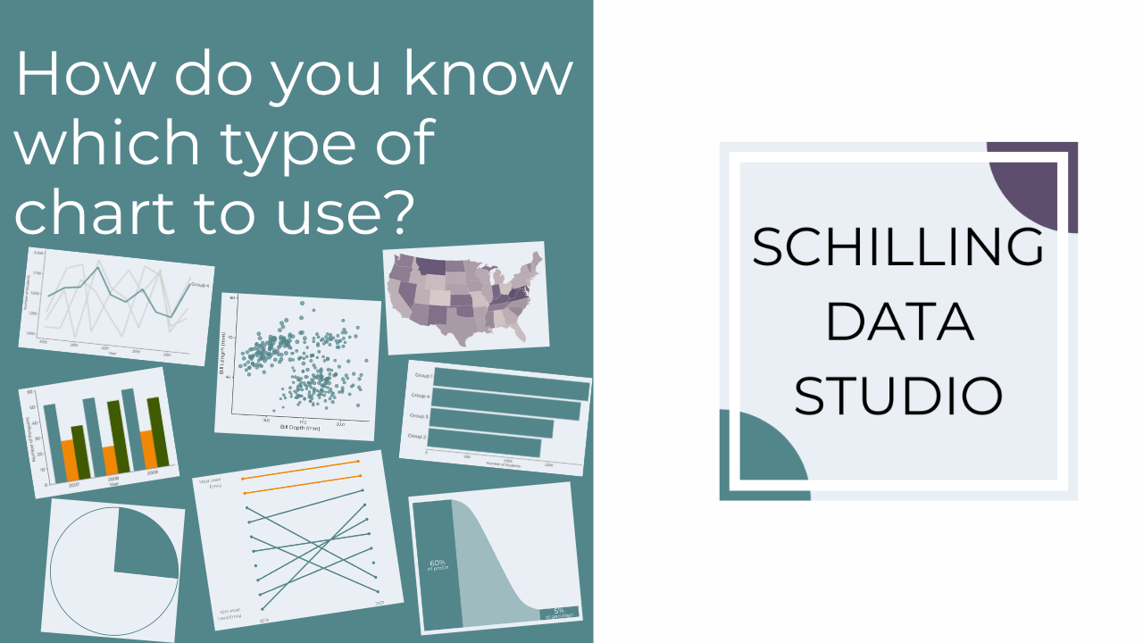
You know your audience, you've got your data, you're ready to visualize....but hold on - how do you know which type of chart to use?
I've been doing a series of posts over on Instagram about when you should use different types of charts (check out the Chart Types highlight).
Determining which type of chart to use comes down to three factors:
1. What type of data do you have?
If your data is all numeric, consider scatter plots, histograms, and heat maps.
If your data is all categorical, stick to variations of bar graphs, lollipop charts, and maybe tree maps and pie charts (if you only have a few categories).
With a combination of numeric and categorical data, you have a few more options - you could use any of the already mentioned charts, or maybe a line graph would work if the data includes a time variable, maps can be great if your data has a geographic component, or try out an alluvial diagram or slope chart to show differences between groups or flow over time.
2. What is the data literacy of your audience?
At its most basic level, data literacy is the ability to read and understand data. Think about your audience's comfort with data as well as their familiarity with the topic of your data.
If your audience is uncomfortable with data, use a straightforward, common chart (like a bar chart) and provide extra context about where the data comes from and what it shows.
If your audience is unfamiliar with the topic, provide clear key takeaways and connect them to the broader context of the topic area.
If your audience is comfortable with data and familiar with the topic, a more novel chart (like an alluvial diagram or even some sort of creative, custom visualization) can be used, but it's still important to include context about the data and its source.
In all cases, it's helpful to include the main message you want your audience to take away from the chart in the title.
3. What do you want your audience to be able to do?
When your audience looks at the chart, what do you want them to do? Do you want them to make comparisons? Make accurate estimates of values? Explore relationships?
The task you want to accomplish with your data will support your chart choice. For example, if you want to show a relationship between two numeric variables, a scatter plot would be a good choice. On the other hand, if you want the audience to compare values over time, use a line graph. If it's important for them to make accurate estimates of the values, a bar graph is the way to go or even a table of numbers. Check out my post on perceptual tasks to learn more about which charts are best for accurate estimations.
Once you've answered these three questions, pick a couple chart types to experiment with and see how well they communicate your message.
This post originally appeared in my newsletter, the Studio Scoop. Want more stories and data viz tips like this? Subscribe below.
Stay connected with news and updates!
Join our mailing list to receive the latest news and updates from our team.
Don't worry, your information will not be shared.
We hate SPAM. We will never sell your information, for any reason.
