How does color tell us where to focus?
May 17, 2022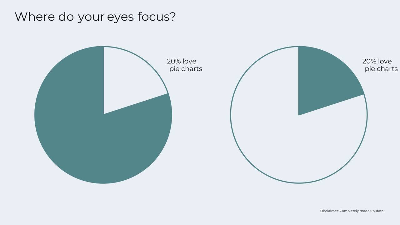
Recently I completed a Human Resources training that had a few pie charts like the one below. The segment with the metric being focused on (in this example, 20% love pie charts, which is a completely made up statistic I created for this example) matched the background of the page and the remaining segment was shaded with a brand color.

I noticed that my eyes focused on the shaded portion of the chart rather than the portion of the chart with the highlighted metric. This meant I didn't see the main point of the chart (that 20% love pie charts) first. My eyes went to the unlabeled "other" category and then scanned around until I saw the annotation and realized that I should have focused on the non-shaded part of the chart first.
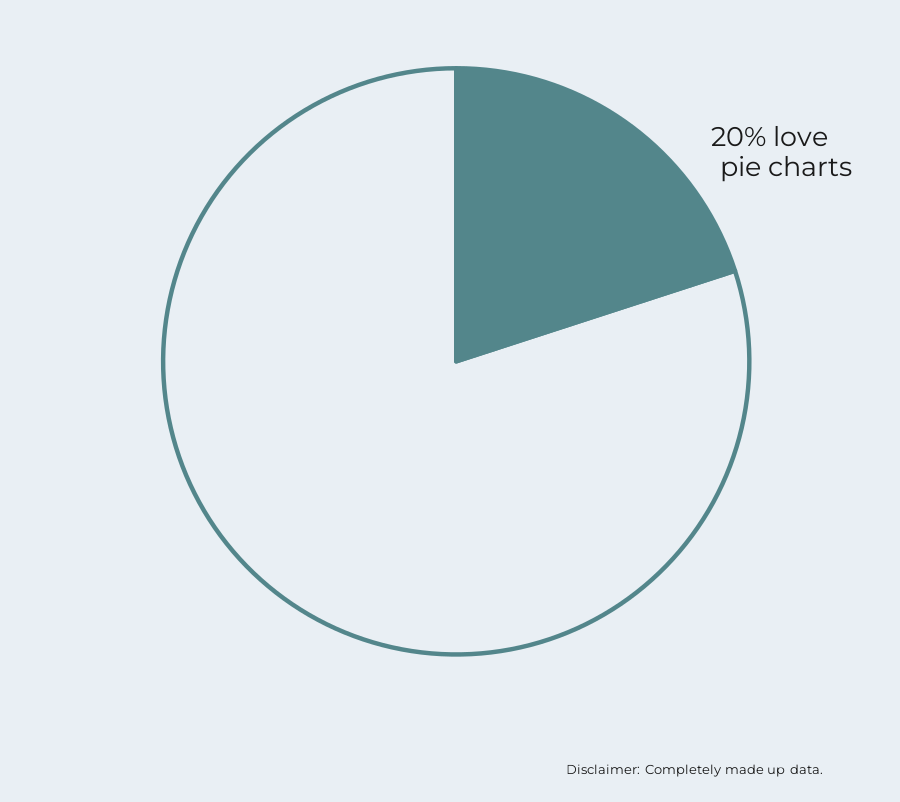
Alternatively, if the portion of the pie chart with the main message is shaded in, my eyes go straight to that area of the chart and then I immediately read the label.
We pay attention first to the parts of a data visualization that are darker in color because the darker color implies to our brains that those parts are more important.
If we want to highlight the 20% portion of the pie chart, we should put that segment in the darkest color so that the audience pays attention to it first. This applies across all types of charts, not just pie charts - use darker colors in data visualization for emphasis and to show importance.
Sign up for our newsletter for more data visualization tips and tricks, to get the behind the scenes look at Schilling Data Studio, and be the first to know when new courses come out!
Stay connected with news and updates!
Join our mailing list to receive the latest news and updates from our team.
Don't worry, your information will not be shared.
We hate SPAM. We will never sell your information, for any reason.
