When the data gets lost in translation
Mar 08, 2023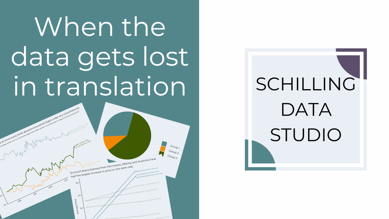
I find that one of the hardest parts about creating graphs is knowing what's important to include.
When faced with a dataset or an ambiguous question from a client, it's hard to know exactly where to start.
Does this sound familiar?
There are two things that help me with this challenge.
The first is improving my skills in data translation: figuring out the difference between what the client is asking for and what they actually want.
This translation is necessary because we often don't use the same vocabulary when talking about the data.
Or we do use the same words but we mean different things.
For example, when I say "students" I might mean only students who attend a program full-time and are in their first year.
But the client might mean all students in the program, regardless of their status.
If I don't clarify what they mean when they say "students," I'm going to provide them with the wrong information.
And they're going to be very confused.
Plus, I'll have to redo the work to provide the right data after we go back and forth on definitions for awhile.
So, save yourself (and your client) some time, and get clear on the translation between what the client says and what they actually mean right at the start.
The second thing that helps with this challenge is following a design process.
A design process is a step-by-step framework that you follow when creating a product, like a data viz.
Each step of the process helps you identify key requirements and refine the client's needs.
This results in a better final data viz because you can spend more time on the design of the viz rather than figuring out the steps to take, and you considered your user during the whole process.
So, you get a final graph that meets the needs of the client and provides the right information with an engaging design.
If you'd like to learn more about my Data Viz Design Process, check out this free workbook and training I put together.
This post originally appeared in my newsletter, the Studio Scoop. Want more stories and data viz tips like this? Subscribe below.
Stay connected with news and updates!
Join our mailing list to receive the latest news and updates from our team.
Don't worry, your information will not be shared.
We hate SPAM. We will never sell your information, for any reason.
