Spot the difference between these two graphs - why does it matter?
May 31, 2022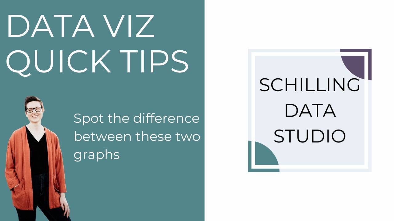
What do you notice about the two graphs below? Can you spot the differences?

In the left graph, there is no margin and the bars are very close together. In the right graph, a margin has been added and the bars have more space between them.
Empty space in a data visualization makes it easier to read, reduces the cognitive load for the audience, and helps focus the audience's attention on the important pieces. Notice how much nicer it is to look at the right-hand graph. With empty space added around and in the graph, it becomes easier to read and interpret.
Empty space improves the effectiveness of graphs. Using empty space in presentations and reports also helps improve effectiveness because it creates a hierarchy of information.
Let your data breath by adding empty space around it.
Subscribe to our newsletter for more data visualization tips and to be the first to know when our courses are released!
Stay connected with news and updates!
Join our mailing list to receive the latest news and updates from our team.
Don't worry, your information will not be shared.
We hate SPAM. We will never sell your information, for any reason.
