Let's Talk About Pie Charts
May 10, 2022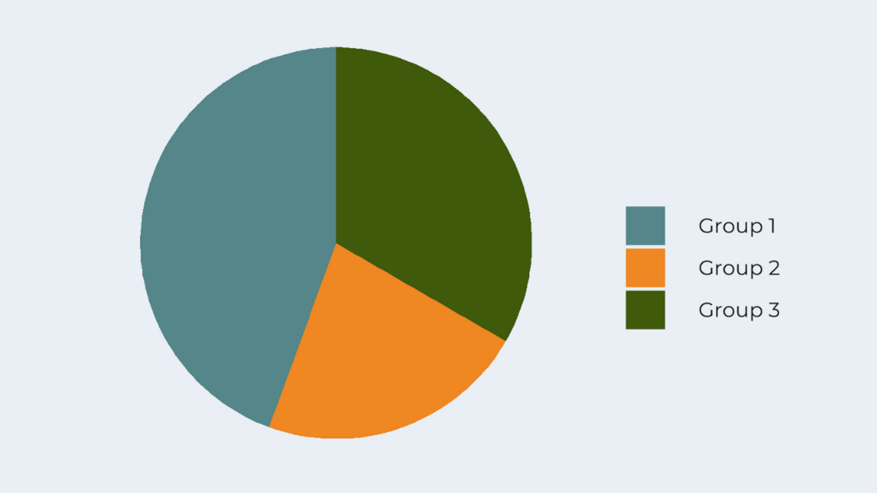
Let's Talk About Pie Charts! There are strong feelings about pie charts in the data visualization community. In this article, I’ll share some of my thoughts and when I think pie charts can be effective.
First, pie charts with too many segments are hard to read and understand. It’s hard for the audience to make accurate estimates and comparisons with angle and area. This means it’s difficult to accurately estimate what percentage is taken up by Group 7, the bright green segment. And it’s hard to accurately compare that percentage to the percentage represented by Group 5, the dark blue segment.
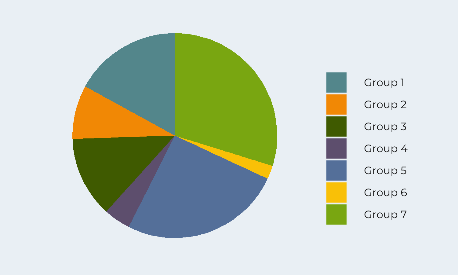
With the large number of segments in the pie chart, we also have to spend a lot of time glancing between the legend and the chart to figure out what each segment represents.
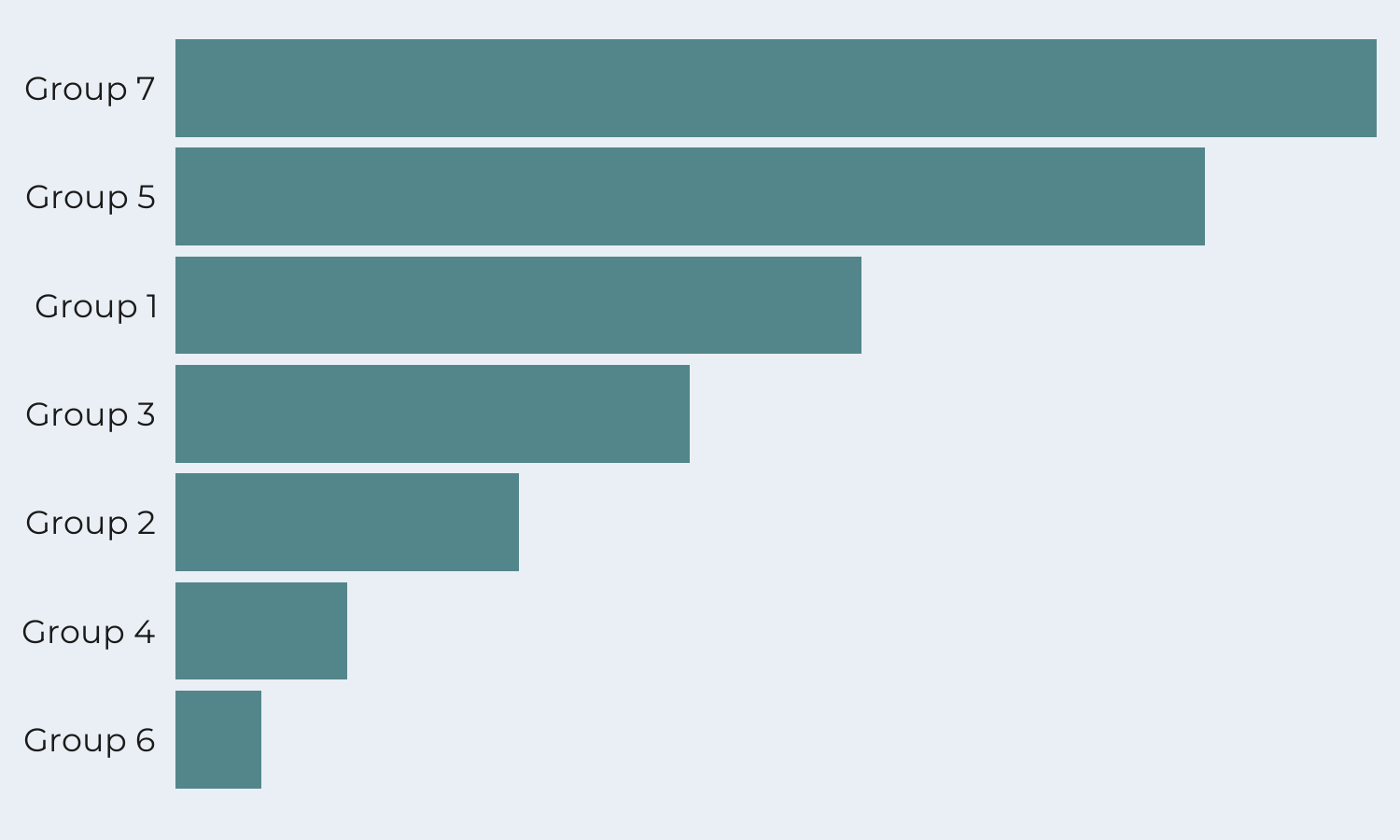
In this case, it’s more effective to use a bar graph. There’s no longer a need to use different colors since each bar is labeled on the y-axis. And it’s a lot easier to make comparisons and estimations accurately.
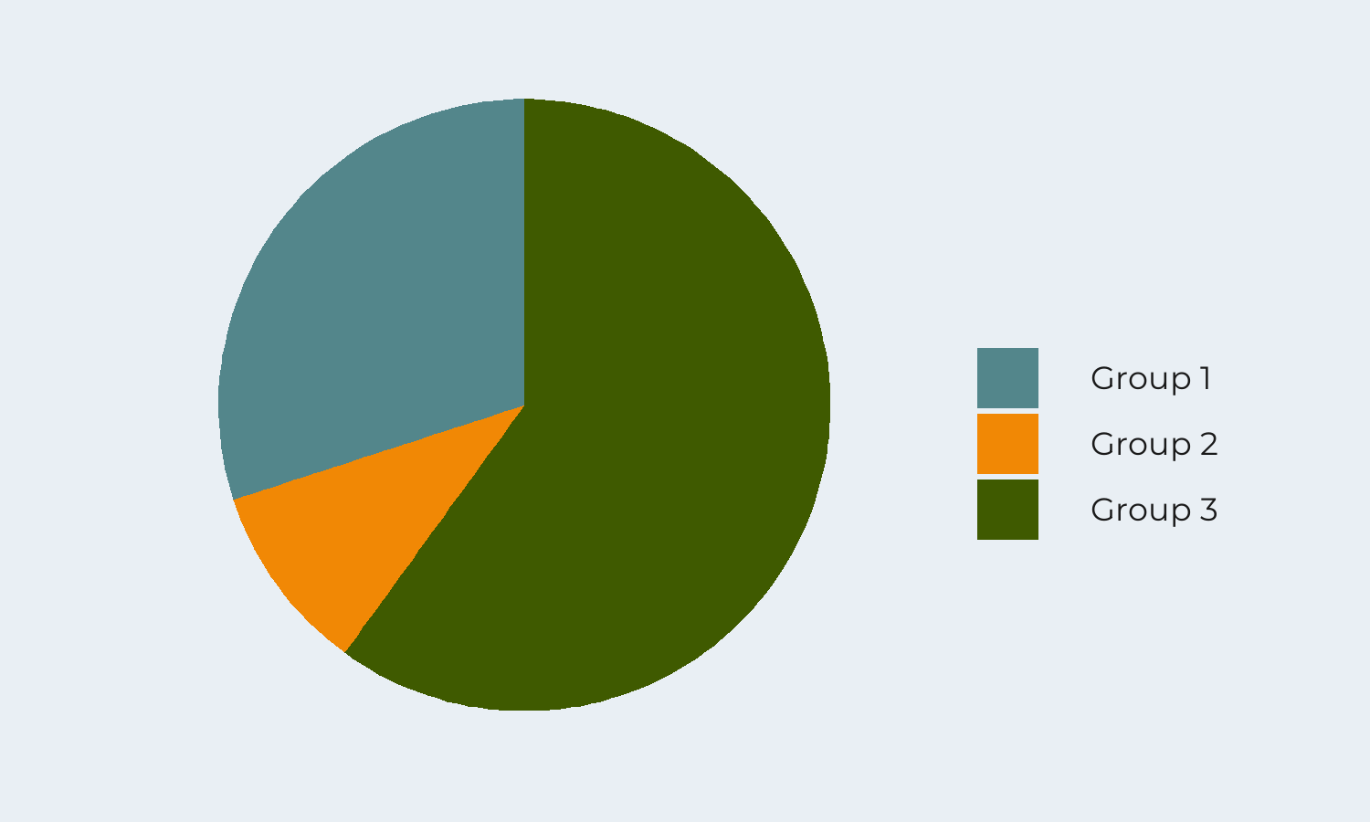
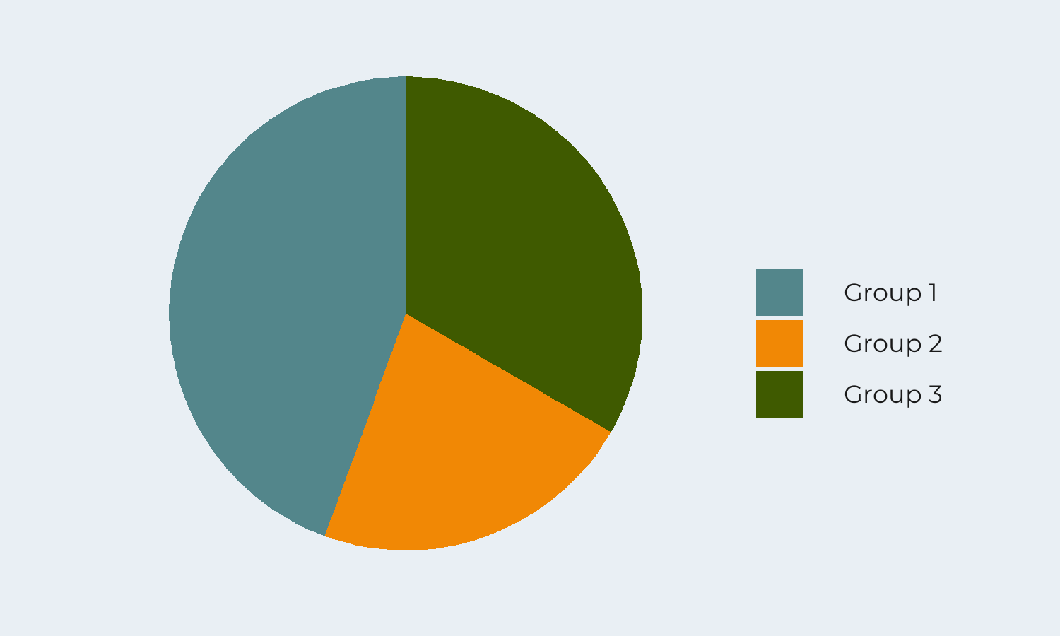
With a small number of groups (2 or 3), a pie chart can be effective. In this case, a pie chart is most effective when there are large differences between the percentages represented, as shown here. Pie charts are good for showing part to whole relationships. For example, we want to show the percentage of people who agreed, disagreed, and were neutral on a statement, such as “Pie charts are not effective charts.”
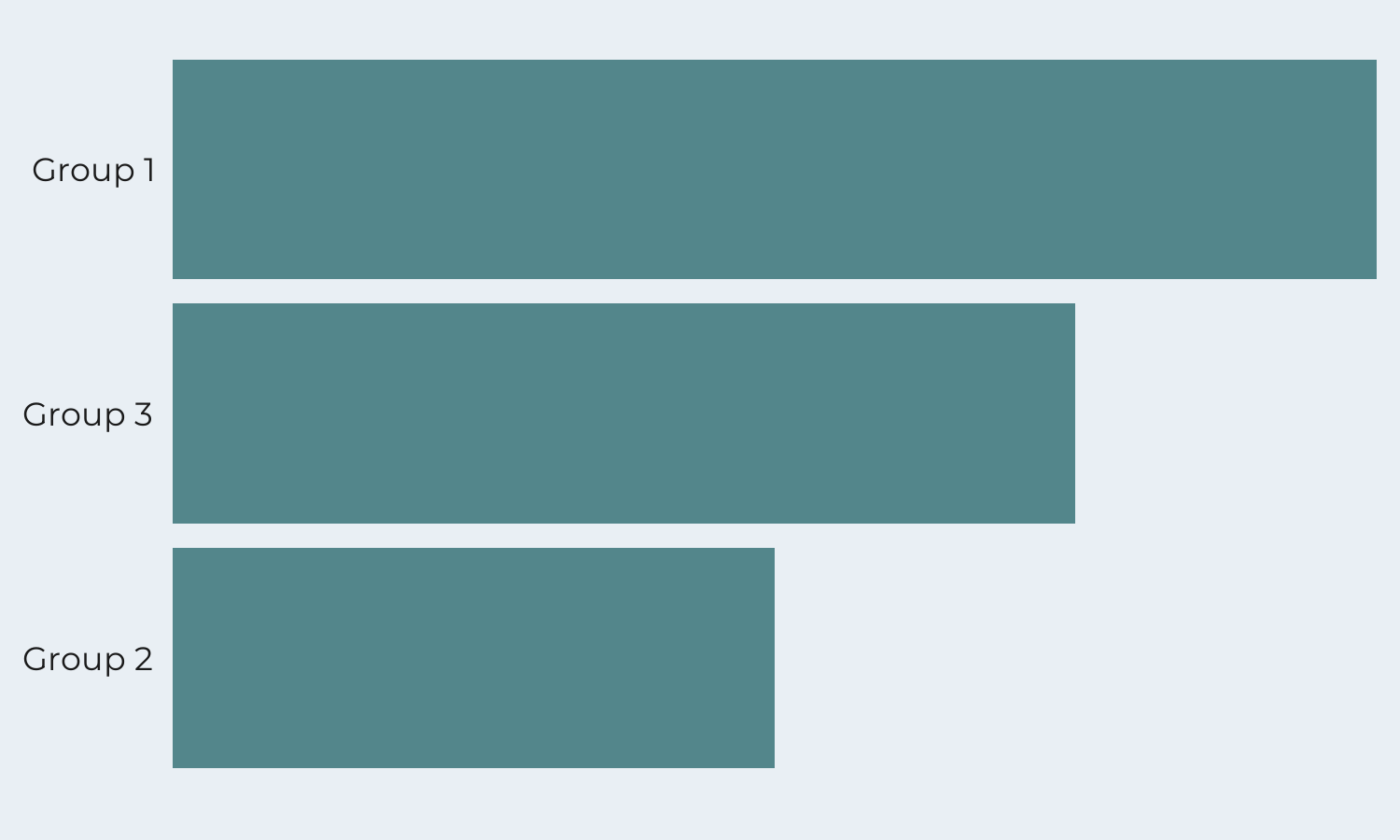
In the case when the percentages are similar, a pie chart might not be as effective. Here, it’s challenging to estimate accurately how much larger Group 1 is than Group 3, and a bar graph may be a better choice.
In the bar graph, it’s easier to make accurate estimations and comparisons between the groups. As humans, we’re better at comparing and estimating data when length is involved. This means, that we’re more accurate when making comparisons between the length of the bars.
Let me know what you think – are you pro- or anti- pie charts? What have you learned today that you can use next time you create a data visualization?
Sign up for our newsletter for more data visualization tips and tricks, to get the behind the scenes look at Schilling Data Studio, and be the first to know when new courses come out!
Stay connected with news and updates!
Join our mailing list to receive the latest news and updates from our team.
Don't worry, your information will not be shared.
We hate SPAM. We will never sell your information, for any reason.
