How to Make a Plot in R
Mar 06, 2023
Grammar of Graphics
A grammar of graphics is a layered approach to creating a plot. The basic idea is to build a plot up layer by layer, specifying different parts of the plot as you go. The main plotting package in R is called ggplot2, and the gg stands for grammar of graphics. This package is one of the many packages included in the tidyverse collection of packages. Check out the How to Get Started Using R post for more about packages.
To create a plot in R, we start with specifying the data layer, the data we want to visualize. Then, we define how the data will be mapped to plot elements, such as x and y, using aesthetics mappings. After that, we add on geometric objects to define how those plot elements will be displayed. For example, as points or lines or bars. Next, we can define scales, coordinate systems, and statistical transformations to change how the data is presented. Finally, we can add labels and legends and adjust the theme or the look and feel of the plot.
Every piece of a plot can be defined programmatically and is completely customizable, making this a very powerful process. Admittedly, it can feel a bit overwhelming at first, and it takes some time to get a feel for the different functions used in the process. But the layered approach and the flow of the process remains the same with each plot, allowing us to repeat the same framework each time and experiment with different visual elements.
Making Our First Plot
Let’s make our first plot!
To begin, create a new R script (refer to the R Script section of How to Get Started Using R post for a reminder on how to create an R script).
The first step for any R script is to load the packages required. We will be using two packages for our first few plots: tidyverse and palmerpenguins.
Make sure you have these packages installed by running install.packages(c("tidyverse", "palmerpenguins")).
The tidyverse package is actually a collection of packages used for data processing, analysis, and visualization. When we load it, we will see a list of all the packages included. For plotting, we use functions from the ggplot2 package. We will be using functions from other packages included in the collection later on.
The palmerpenguins package contains the data we’ll use for our first plot (and several follow-on plots).
The data in the palmerpenguins package is a set of penguin observations. Data were collected and made available by Dr. Kristen Gorman and the Palmer Station, Antarctica LTER, a member of the Long Term Ecological Research Network.
There are three species of penguins in the data: Adélie, Chinstrap, and Gentoo. The data set includes information about the penguins such as the island on which they were observed, their bill length and depth, and their flipper length. Here are ten rows from the data set.
| species | island | bill_length_mm | bill_depth_mm | flipper_length_mm | body_mass_g | sex | year |
|---|---|---|---|---|---|---|---|
| Chinstrap | Dream | 45.6 | 19.4 | 194 | 3525 | female | 2009 |
| Gentoo | Biscoe | 44.5 | 14.7 | 214 | 4850 | female | 2009 |
| Gentoo | Biscoe | 45.1 | 14.5 | 215 | 5000 | female | 2007 |
| Adelie | Torgersen | 35.9 | 16.6 | 190 | 3050 | female | 2008 |
| Adelie | Dream | 40.9 | 18.9 | 184 | 3900 | male | 2007 |
| Adelie | Dream | 41.1 | 17.5 | 190 | 3900 | male | 2009 |
| Adelie | Dream | 35.7 | 18.0 | 202 | 3550 | female | 2008 |
| Adelie | Torgersen | 42.9 | 17.6 | 196 | 4700 | male | 2008 |
| Adelie | Torgersen | 36.2 | 17.2 | 187 | 3150 | female | 2009 |
| Chinstrap | Dream | 58.0 | 17.8 | 181 | 3700 | female | 2007 |
Loading the packages gives us access to the data and functions included within them. We have to load packages every time we open RStudio. It’s a good practice to load your packages at the top of your R script.
Let’s do that now. Type the following code at the top of your R script in the Source pane. Then highlight those two lines and press CTRL / COMMAND + ENTER to run the code. You should see the output printed below in your Console.
library(tidyverse)
library(palmerpenguins)
── Attaching packages ─────────────────────────────────────── tidyverse 1.3.2 ──
✔ ggplot2 3.3.6 ✔ purrr 0.3.4
✔ tibble 3.1.8 ✔ dplyr 1.0.10
✔ tidyr 1.2.1 ✔ stringr 1.4.1
✔ readr 2.1.2 ✔ forcats 0.5.2
── Conflicts ────────────────────────────────────────── tidyverse_conflicts() ──
✖ dplyr::filter() masks stats::filter()
✖ dplyr::lag() masks stats::lag()The messages under library(tidyverse) in the Console list out the packages loaded in the collection - notice ggplot2, which is our main plotting package. There is also a message about Conflicts - this portion of the message tells us that some functions, specifically filter() and lag() from the dplyr package are overwriting the functions with those same names in the stats package, which is part of base R. The two colons :: after the package name help us identify the source of the function. For example, dplyr::filter() can be read as “the filter function from the dplyr package”.
We’ve now completed the first two steps of creating a plot in R - we created an R script, then we loaded the packages we need.
The next step is to load our data. In this case, we’ve actually already done that by loading the palmerpenguins package, but in later examples, we’ll read a file to load the data.
Let’s take a look at the data in the penguins data set. In your R script, type the following then press CTRL / COMMAND + ENTER to run the code.
view(penguins)
This code will open a table view of the penguins data set. The screenshot below shows part of this view.
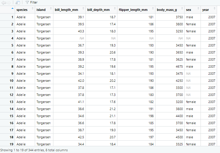 A screenshot of the penguins data set table view accessed by running view(penguins).
There are a few things to note about this table view we have accessed by running view(penguins). First, the column names are shown at the top of each column in bold font. The first column is named “species”, the second column is named “island”, and so on. Second, the bottom of the view says “Showing 1 to 19 of 344 entries, 8 total columns”. This tells us that our data set has 344 rows and 8 columns. We can also see the individual data points available and where there is missing data indicated by an NA.
We loaded the necessary packages and we have our data, so now we’re ready to create our first plot!
Referring back to the grammar of graphics principle, we build our plot layer by layer. The first layer is the data, and we use a function called ggplot() to specify the data we will use for our plot. Let’s see how this works.
In the ggplot() function there is an argument (or input) called data, we use the equals sign to set the data argument equal to our penguins data set.
ggplot(data = penguins)
If you type and run the code above in your R script, you will see a gray square appear in the Plots pane. This is the foundation of our first plot.
The second layer is the mapping which tells R what columns or variables in our data set we want to place on certain elements of the plot. Let’s see if there is a relationship between the bill depth and the bill length of the penguins in our data set. To explore this relationship, we will put the bill depth on the x-axis and the bill length on the y-axis. We tell R to do this using the mapping argument inside the ggplot() function.
After the data = penguins argument within the ggplot() function, we add a comma to tell R we’re going to add more arguments or inputs. Then we write mapping = to specify that we’re now going to define the aesthetic mappings or how we want R to place variables onto plot elements.
This time, we have to use another function called aes() on the right-hand side of the equals sign. The aes() function allows us to define how variables in our data are mapped to visual elements (or aesthetics) of the plot. Within this function, we set the x and y arguments to the column names from our data set for bill depth and bill length.
ggplot(data = penguins,
       mapping = aes(x = bill_depth_mm,
                     y = bill_length_mm))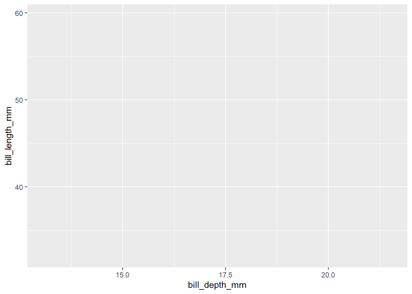
Running this code adds grid lines to our plot and puts each of the variables on their respective axes. But we don’t see any data yet. This brings us to the third layer of the process, adding geometries. Geometries tell R how we want to see the data. In this case, we want to see a point for each penguin in the data set showing its bill depth and bill length, so we add on to the ggplot() function by adding a + to the end of the line of code and then typing geom_point(). This will add points for each x and y coordinate defined by our data and mapping arguments.
ggplot(data = penguins,
       mapping = aes(x = bill_depth_mm,
                     y = bill_length_mm)) +
  geom_point()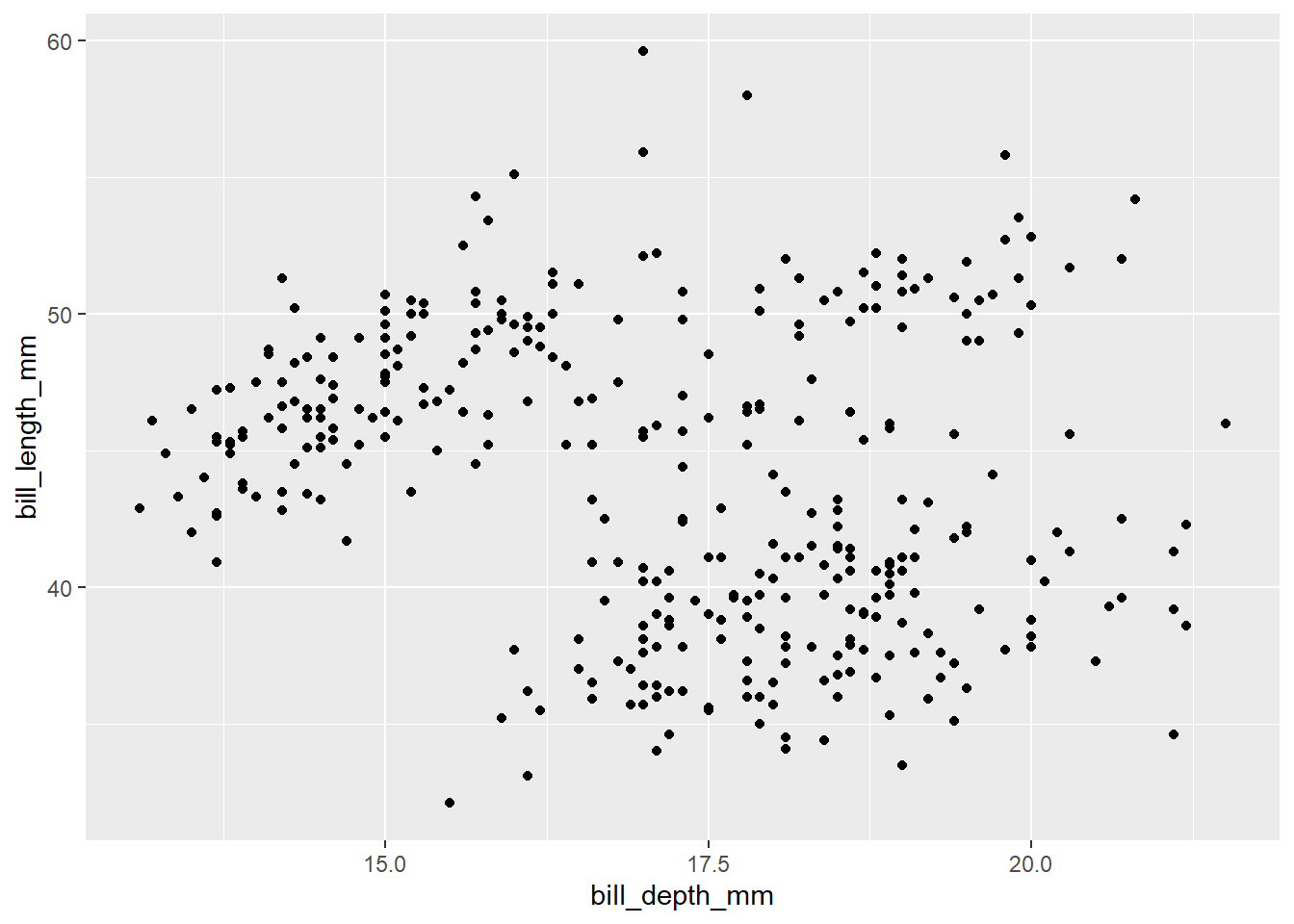
If you ran the code above, you received a warning in the Console: “Warning: Removed 2 rows containing missing values (geom_point).” This warning tells us that two rows of data had missing values for in bill depth or bill length (in this case, these rows are actually missing values for both), so the plot does not include those two rows.
Now that we have our basic plot created by defining the data, mapping, and geometry, we can add on to it. Can we add color to each point to show the species?
Yes, we can! We do this by adding to the aes() function in the mapping argument. After y = bill_length_mm, add a comma and then type color = species. Now, R will map data in the species column onto the color for each point.
ggplot(data = penguins,
       mapping = aes(x = bill_depth_mm,
                     y = bill_length_mm,
                     color = species)) +
  geom_point()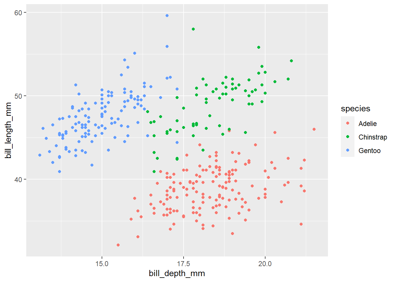
Now you've made your first plot in R!
This is an excerpt from my upcoming book, Data Viz in R. To get the latest on the release of this book, upcoming trainings, and data viz tips, subscribe to my newsletter below.
Stay connected with news and updates!
Join our mailing list to receive the latest news and updates from our team.
Don't worry, your information will not be shared.
We hate SPAM. We will never sell your information, for any reason.
