A toast the title
Apr 26, 2023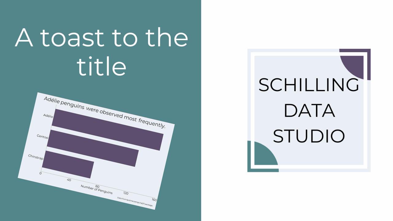
We tend to describe what a graph is showing when we write the title.
For example: Number of Penguins by Species.
This is super common, I see it all the time, and I've done it frequently as well.
But, there's a better use for the title!
Use it to explain the key message or headline from the graph.
For example: Chinstrap penguins were observed least frequently.
When you do this, your audience understands right away what you want them to see in the graph.
They view the graph from this starting point.
There can be more than one message from a graph, and your audience can explore the visualization to find any underlying messages.
But when you give them the key takeaway up front, they don't have to work as hard to interpret the graph.
AND you ensure that they get the main headline you want them to know from the data.
So, how are you using titles and are you using them in the most effective way?
This post originally appeared in my newsletter, the Studio Scoop. Want more stories and data viz tips like this? Subscribe below.
Stay connected with news and updates!
Join our mailing list to receive the latest news and updates from our team.
Don't worry, your information will not be shared.
We hate SPAM. We will never sell your information, for any reason.
