The Data Viz Design Process - Part 4
Jul 26, 2022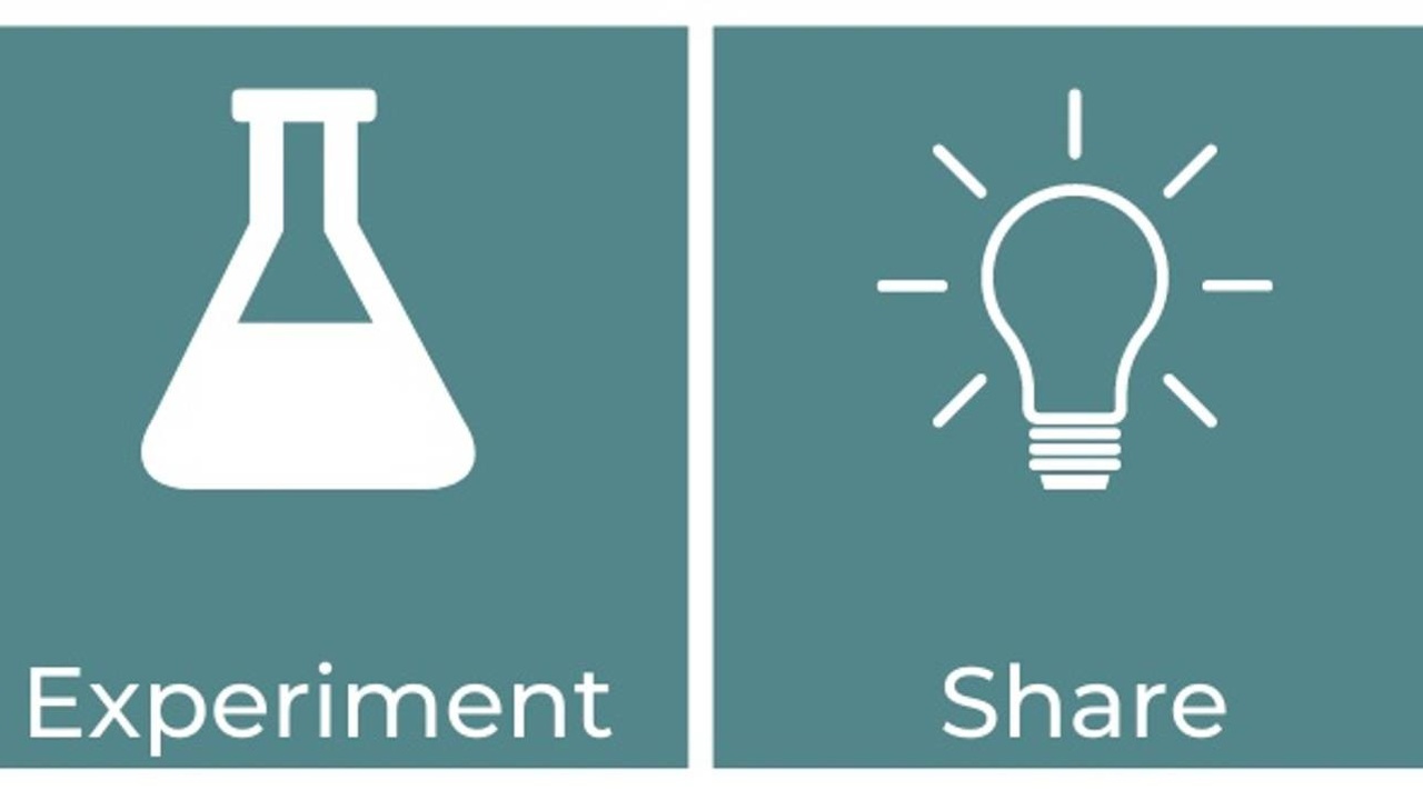
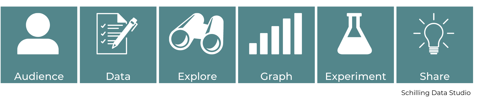
In this series of articles, I'm going to share my data viz design process. A step-by-step framework for creating graphs and charts. Part 1 explained design, design thinking, and the benefits of using a design process. Part 2 explained the first two steps of the process - audience and data. Part 3, explained explain the next two steps of the process - explore and graph. In this final part, I'll explain the last two steps and wrap up with a summary.
Step 5: Experiment
The fifth step of my data viz design process is to experiment.
In this step, think again about the audience - is the data viz telling them what they need to know? Is the graph you chose something they will be able to understand easily? Will they get the key message and understand the story?
During this step, you can ask a friend or colleague to look at the draft graphs you made in the previous step and ask them for feedback. Ask them to tell you where their eyes focus and what key takeaway they understood.
In this step, you don't need a perfect graph to share. You just want the minimum viable product, a rough draft. Try not to worry about having it all perfect at this point. You're looking for feedback on how it can be improved and what elements could be added or removed.
If you have more than one type of graph you've made, you can experiment with different ones. Show different people different versions and see which one is most effective at communicating the message you found in the Explore step and answering the question you wrote in the Define step. Once you have the feedback from your friend or colleague, you can add or remove elements to your data visualization that will improve it.
The last part of this step is to check that your data viz is accurate and true - is all the data correct? Is the message or finding correct? Especially if you found your own dataset, do a little research to see if other sources (like research articles or news articles from a reputable source) have similar conclusions.
Most members of your audience will take the information in your data viz at face value and assume it is true, so it's really important to make sure that all of the numbers are correct.
Step 6: Share
The final step of my data viz design process is to share your data viz.
Once you've experimented with different graph types and incorporated the feedback from the experiment step, you're ready to refine your visualization and share it with your audience. Notice how your audience engages with the viz - do they get your key takeaway?
As you notice how your audience engages with your data viz, think about how it can be refined. How could it be made clearer so the audience understands the message more easily?
Finally, reflect on what you've learned. After you've presented your data, take some time to think about what you learned about how your audience interpreted your graphs. Think about what you could change in the design in the future to make it even more engaging and effective. Your audience will be engaged with a well designed chart. They'll be more likely to pay attention and try to understand a graph they feel has good design.
Summary
I described most of the steps in this process as if you were working alone, and data viz can be quite a solo activity. However, if you're working with others, it's great to do this process together. It can be particularly helpful to brainstorm ideas about the audience together and all agree on the data and question together to make sure you're all on the same page. It's also great to collaborate with others on the rest of the process as we all bring our own perspectives to data analysis and visualization, so someone else will likely see something different than you.
Data visualization is a very creative and iterative process. There's not one right way to visualize a dataset, and you may not always go through these six steps in this exact order. Sometimes after exploring your data, you may find that your data isn't right for the question you're trying to answer, so you'll have to go back to the Data step. Other times, during the Experiment step, you may find that your audience isn't getting the right message from your graph or they're getting confused or distracted. Then you'll have to go back to the Graph or maybe even the Explore step to refine your visualizations. You can always move back and forth between these steps, and you'll revisit the Audience step at every stage to check in and see if your data viz is meeting your audience's needs.
Following the data viz design process will help streamline your work, save you time, and result in a visualization that is user-centered and therefore more effective.
I'm currently launching my new online course - Data Viz Design Essentials. This course will teach you everything you need to know to create engaging graphs that clearly communicate your data, and the first launch has special introductory pricing.
Stay connected with news and updates!
Join our mailing list to receive the latest news and updates from our team.
Don't worry, your information will not be shared.
We hate SPAM. We will never sell your information, for any reason.
