When you pick the wrong graph
May 10, 2023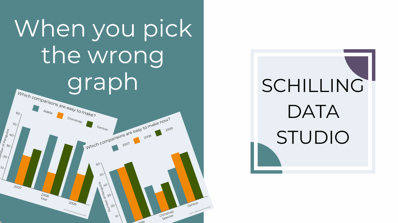
You know that horrible dream where you're sharing data and the audience is just staring blankly back at you?
Or worse, they're getting totally sidetracked and making inaccurate comparisons?
(No? Maybe I'm the only one who has nightmares about presentations gone awry...)
This can happen in real life when you pick the wrong graph to show your data.
But don't worry! I'm here to help.
Have you heard of perceptual tasks?
Perceptual tasks are the steps your audience takes to interpret a data viz and extract the real value represented in the visual.
William S. Cleveland and Robert McGill conducted experiments in the 1980s to determine how well people can estimate and compare two values in a graph across different graph types.
Jeffrey Heer and Michael Bostock replicated and expanded these experiments in 2010.
And research continues today to evaluate how well different graph types perform for comparison and estimation of values.
Based on this research, we know position (think bar graphs) allows for more accurate estimates and comparison while area (think tree maps) results in less accurate estimates and comparisons.
Once you know this, you can create graphs that allow for accurate estimates and comparisons by the audience.
And, you won't have to worry about nightmare situations where you audience doesn't get it or can't complete the task you want.
For some examples and the full hierarchy of graph types, check out this video I made.
I haven't been uploading many new videos to my YouTube channel recently, but here's a great one from last fall with three questions you can ask to figure out what type of graph to use.
Watch it to avoid more nightmare scenarios where your audience looks back at you blankly and totally doesn't get your key takeaway.
Want help creating better graphs? Check out my online course Data Viz Design Essentials and learn how to consistently create clear, impactful, and effective graphs so you never have to worry about a floundering audience again. No more data nightmares for you!
This post originally appeared in my newsletter, the Studio Scoop. Want more stories and data viz tips like this? Subscribe below.
Stay connected with news and updates!
Join our mailing list to receive the latest news and updates from our team.
Don't worry, your information will not be shared.
We hate SPAM. We will never sell your information, for any reason.
