Making a Bar Graph in R
Mar 13, 2023
I like to create data visualizations based on questions I have about the data. The scatter plot we made in the last post was exploring the question: what’s the relationship between bill depth and bill length for the penguins in our data set? Now let’s answer the question: how many penguins on each island are in the data set?
To answer this question, we will make a bar graph showing the number of penguins on each island.
Let’s begin with the ggplot() function. Again, we need to specify the data and mappings. Our data remains the same data = penguins, but our mapping will change. This time, we will set mapping = aes(y = island) this tells R to put species on the y-axis.
ggplot(data = penguins,
       mapping = aes(y = island))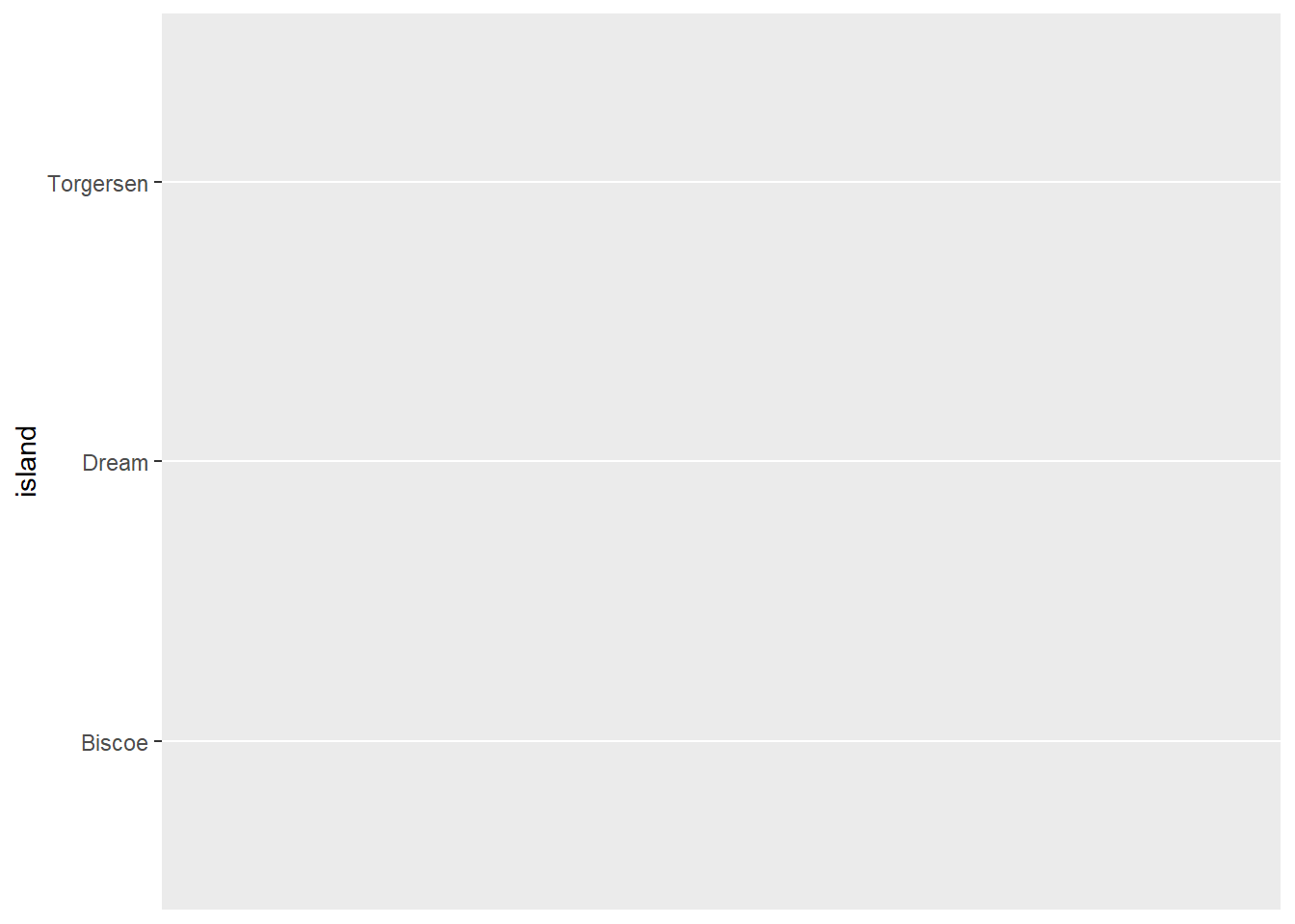
Running this code produces a plot with each island listed on the y-axis and nothing else.
Next we need to define our geometry. In this case, geom_bar() because we want the make a bar graph. We do this by putting a + at the end of the ggplot() function and adding geom_bar().
ggplot(data = penguins,
       mapping = aes(y = island)) +
  geom_bar()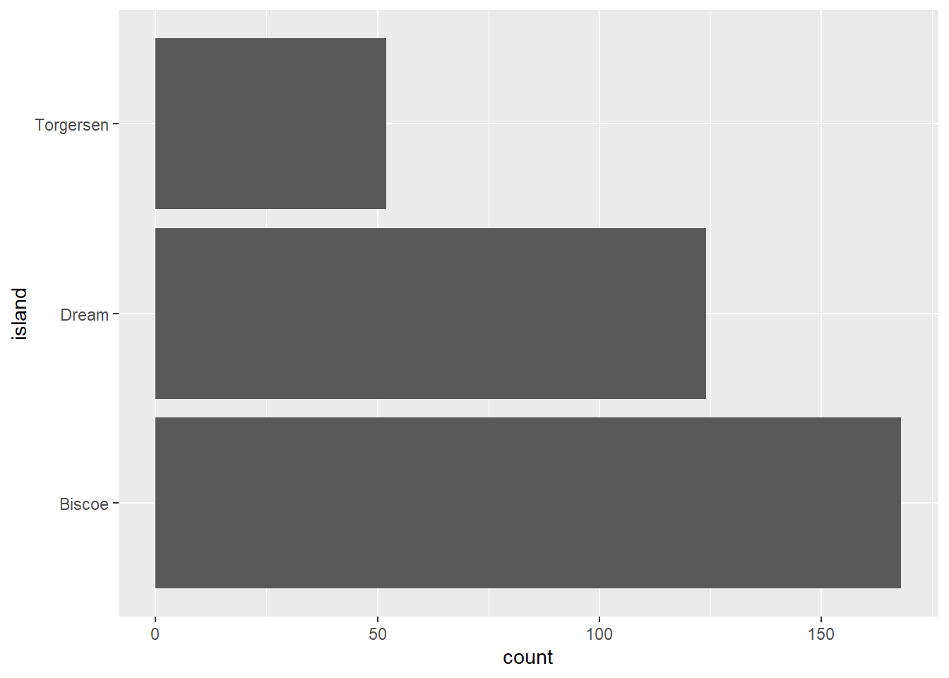
Look at that - there’s now a count on the x-axis and a bar for each island that shows the number of records (i.e. penguins) in the data set on that island. But we didn’t define the x-axis in the code, so how did that happen?
geom_bar() actually computes the counts for us. All we need to do is tell R the categories we want to use, and it does the rest, counting the number of records in each category. If we wanted to see the number of records (i.e. penguins) of each species in the data set, all we need to do is switch out the y column in the code. Like this:
ggplot(data = penguins,
       mapping = aes(y = species)) +
  geom_bar()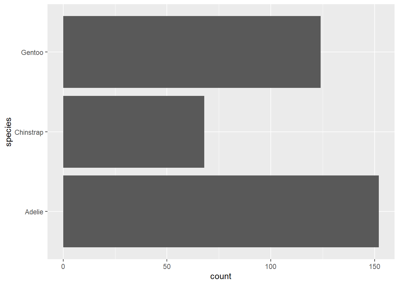
We can see that Adélie had the most penguins in the data set, a little over 150, and Chinstrap had the least, a bit over 65. Notice that R has ordered the species (and the islands in the previous example) in reverse alphabetical order. How could we change that order?
Before I answer that question, I need to explain an R concept known as factors. Factors are used for categorical data. Factors can only have specific values, known as levels. The levels provide a list of categories allowed for the factor.
In the penguins data set, there are three factor (or categorical) variables: species, island, and sex. We can find out the type of each variable (or column) in the data set using the glimpse() function, which is part of the dplyr package, a data processing package that is part of the tidyverse. We’ll learn more about this package soon, but for now, let’s take a look at the glimpse() function.
glimpse(penguins)Rows: 344
Columns: 8
$ species <fct> Adelie, Adelie, Adelie, Adelie, Adelie, Adelie, Adel…
$ island <fct> Torgersen, Torgersen, Torgersen, Torgersen, Torgerse…
$ bill_length_mm <dbl> 39.1, 39.5, 40.3, NA, 36.7, 39.3, 38.9, 39.2, 34.1, …
$ bill_depth_mm <dbl> 18.7, 17.4, 18.0, NA, 19.3, 20.6, 17.8, 19.6, 18.1, …
$ flipper_length_mm <int> 181, 186, 195, NA, 193, 190, 181, 195, 193, 190, 186…
$ body_mass_g <int> 3750, 3800, 3250, NA, 3450, 3650, 3625, 4675, 3475, …
$ sex <fct> male, female, female, NA, female, male, female, male…
$ year <int> 2007, 2007, 2007, 2007, 2007, 2007, 2007, 2007, 2007…This function provides a summary of information about our data set. We can see the number of rows (344) and columns (8). We also get a list of each of the column names and a preview of the first several rows of data. After each column name in <>, we see the data type of each column. species, island, and sex have type <fct>, which means they are factors. bill_length_mm and bill_depth_mm have type <dbl>, which means they are doubles or numbers with decimal parts. flipper_length_mm, body_mass_g, and year have type <int>, which means they are integers or whole numbers.
Getting back to the idea of factors, the three factor variables in the penguins data set can only have certain categorical values. For example, sex can only be female or male, and island can only be Adelie, Chinstrap, or Gentoo. To see the categorical values of a factor, we use the levels() function.
levels(penguins$species)[1] "Adelie" "Chinstrap" "Gentoo" Here I’ve introduced another new operator, the $. This operator in R allows us to reference a specific column within a data set, so penguins$species means get the species column from the penguins data set.
When we run levels(penguins$island), we get a list of the three possible values (i.e. categories) for the island variable.
Getting back to our original question, how can we change the order of the islands in the bar graph? Factors by default are ordered alphabetically, but we can change that order using functions from another tidyverse package, forcats, which provides functions for working with categorical variables (i.e. factors). Later on in this book, I’ll show how we can manually set the order of a categorical variable.
For now, there’s a useful function in the forcats package called fct_infreq(), which will reorder a factor (i.e. categorical variable) by the frequency of its values. Let’s see how this works.
So far, we’ve set the arguments inside the aes() function directly to the names of the columns in the data set. But we can also set these arguments equal to the result of a function. In this case, we want to reorder the values in species by their frequencies (or how often they occur in the data). To do this, we put island inside the fct_infreq() and then set y equal to it: y = fct_infreq(species).
ggplot(data = penguins,
       mapping = aes(y = fct_infreq(species))) +
  geom_bar()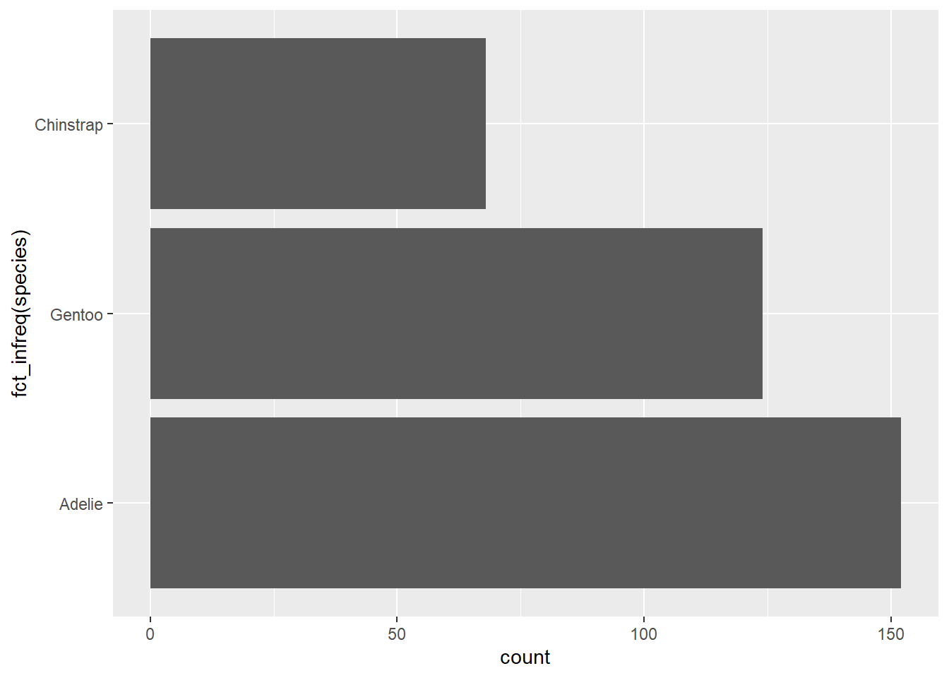
Now, in the graph the bars are sorted from least to greatest. Notice too that the y-axis title is now “fct_infreq(species)”. Whatever we set the plot elements to in the aes() function mapping determines the title of that element in the plot. Later on we’ll see how we can change these titles to something more readable and meaningful.
What if we just wanted to put the species in order alphabetically from top to bottom? Then we can use another useful function from the forcats package called fct_reV(). This function reverses the order of the factor levels. Let’s see how it works.
ggplot(data = penguins,
       mapping = aes(y = fct_rev(species))) +
  geom_bar()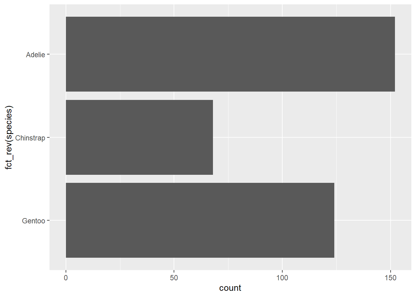
We put the name of the column inside the fct_rev() function, resulting in fct_rev(species), and use that in the aes() function to define the y-axis for the plot. Now, the penguin species are in alphabetical order from top to bottom.
Now, we've created a bar graph and learned how to reorder the categories!
This is an excerpt from my upcoming book, Data Viz in R. To get the latest on the release of this book, upcoming trainings, and data viz tips, subscribe to my newsletter below.
If you want to learn how to use R for data viz, sign up for the waitlist for my online course Intro to R for Data Viz.
Stay connected with news and updates!
Join our mailing list to receive the latest news and updates from our team.
Don't worry, your information will not be shared.
We hate SPAM. We will never sell your information, for any reason.
